
OVERVIEW
Merchants store-front is a video commerce platform to discover live video shopping experience. It displays various shopping videos(small and long) related to products. The store-front enables the user to do live video shopping and in video checkout instantly. It also make the users connect with the merchants directly after scheduling a one-to-one video call which gives them a personalized experience of shopping.
As Product Designer, I worked with the other design member in the team, PM and engineering team to redesign and deliver the web view 2.0 which achieve DAU (+40%), Avg Monthly Orders (+60%), Avg. Session Duration (+24%), Bounce Rate (5%), Exit Rate (7%) and Product Return Rate(0%).
As Product Designer, I worked with the other design member in the team, PM and engineering team to redesign and deliver the web view 2.0 which achieve DAU (+40%), Avg Monthly Orders (+60%), Avg. Session Duration (+24%), Bounce Rate (5%), Exit Rate (7%) and Product Return Rate(0%).
BACKGROUND
When I joined the team, Baaz already has a good presence on Instagram and YouTube, while the merchant store-front had relatively low traffic and high bounce rate. The team wanted to redesign and rebrand it, attracting more customers to purchase products from the live video and the other exclusive videos increasing time rate on the platform and enhancing brand loyalty.
| Problem: Users are not staying on the platform or coming back
USER TESTING OF INITIAL STORE-FRONT
To find out the reasons for the problem, few user testing sessions were conducted with actual target audience of our merchants and our user which is the merchant itself. Users pointed out they don’t know exactly what the platform is about, and the colour and layout are not what they expected to be a fashion-related website. According to the merchants the communication happening was not clear and the main features were not highlighted properly.
| I don’t understand the platform if I have missed out the joining link of live video shopping, the homepage has nothing much to inform how can I go back from the platform itself. Confused navigation.
- Participant of the user testing.
- Participant of the user testing.
USER RESEARCH
I further analysed the research data gathered by the marketing team to find out who the users are and their preference. I found users love video shopping while sitting at their comfort place, asking for discounts directly from the merchant, while afraid of trusting if find the faulty products and it doesn’t get return. They are price-sensitive and valuing offering, experience, and convenience.

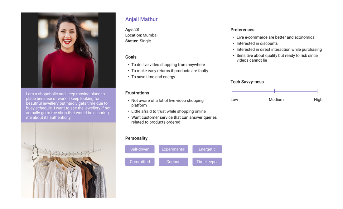
USER PERSONA
Merchants who are retailers of fashion & jewellery products selling them either online through instagram, youtube or facebook, some might have the websites as well which has not been maintained or are shitty in terms of understanding and design wise both. They can be the ones who are selling offline but are interested in knowing about selling online.
End Consumer who are actually the buyer of such products and eagerly waits for offers and discounts.
I created a persona based on the user research and, which helped me communicate my findings with the team. The persona also ensured that users’ goals and frustrations were at the front of my mind as I progressed with the design
Competitive Analysis
I chose and compared the two major competitors which has similar services and business models with Baaz, aiming to find out what’s unique about Baaz webstore feature and what its website should improve.
| I identified Baaz doesn't have engaging content to keep the user busy and platform is not intuitive enough to highlight the main features.
Compare their visual design, platform features and homepage content
Identify the features Baaz lacks:
- User interaction
- In-video add to cart
- In-video checkout
Mood board
I created the mood board to set the tone and communicate with the team about the design direction I’m going, also to gather design inspirations for myself.
| The brand images we want to deliver are “Engaging”, “Delightful” and “Trustworthy”

NEW SITEMAP
Based on the finding from user testing and competitive analysis, I proposed some new feature to better serve users and promote the business.
| I restructured the sitemap to accommodate the new features.

ITERATION
We have been through several iterations in terms of the color, structure, content, and labeling. How to better-using space is one of our major focuses. For example, we decided getting rid of the fullscreen landing page, so users can filter and browse the events once they land on the website.
| Baaz should serve as a convenient tool for users to discover live commerce.

Design - Homepage
The UI colour was changed from dark purple to pink based on several iterations and user feedback. The current color is the one favoured by most users (7 out of 10) we interviewed.

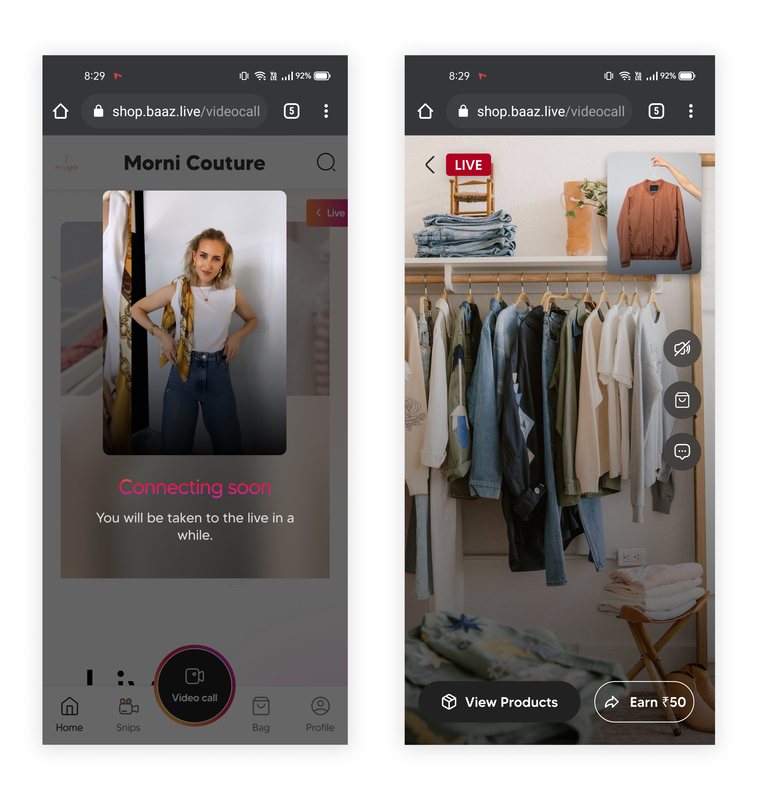
Design - Waiting and Live landing
All the action buttons are made distinguishable and clean, and one supporting copy is added on the waiting screen.
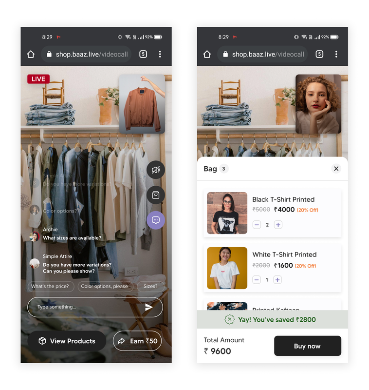
Design - Chat and bag
Chat section has been added with pre-filled questions that are mostly asked by the customers so that it is easy to select and ask. Bottom sheets are made a little more than half so that the video is still visible and available to the user
Implementation
After I finalized the design with the PM, I worked with the engineering team to implement the design by presenting the design to the team, providing UI elements, conducting usability testing, debugging, and designing for new requirements during the development process. It took 1-1.5 months to implement the design for new e-Commerce store.
| Some alignment, full-width and responsive issues are identified and presented to the engineering team to fix during the process.

RESULTS
| After three months, we gladly see the dramatic results from Google Analytics.

Debugging
One of the most important bugs I identified and helped to fix is the full-width issue of videos. Originally the engineering team built the site with every row in full-width, which looks awkward if the video is horizontal. Then we assigned those elements a fixed width to solve the problem. Other bugs include reminding them the uploaded “Product photo” has to be square, otherwise it won’t be cropped into product card properly.
PRELIMINARY USER TESTING
When the design is partly implemented, I conducted several user testing both in-person and online. The testing verifies the design successfully communicates the brand image of particular brand (“engaging”, “welcoming”, “delightful”, “trustworthy”, etc.), also identifies some usabilities issues that could be improved in the future. Our user which are merchant and their user those who are the end customers both suggested few more things which were not working out and changes were done accordingly.
| Some alignment, layout and responsive issues are identified and presented to the engineering team to fix during the process.
MAJOR FINDING
All the participants love the theme colour, no matter what their gender is. They consider it is “a good-looking website”, “well-organized” and “structurally pleasing”.
What surprises me most is, instead of clicking one of the listed events on the homepage, all of them tend to use the filters and search bar to search events first. I also found two usability issues in this process:
What surprises me most is, instead of clicking one of the listed events on the homepage, all of them tend to use the filters and search bar to search events first. I also found two usability issues in this process:
- Some of the participants are not aware of the “add to bag” option on hero video both on homepage and snip page, so they were not clicking directly from the same view, they tried to click and open in full view and then took the further action which could have been done by just one click.
- When there are no matched video with what users are searching for. The result page only informs users there are no matched video, although in a funny way. The best practices will be having some other suggested videos for users so the platform don’t lose these potential customers.
CONCLUSION & LEARNING
Baaz e commerce store is one of my earliest projects, where I am so lucky to meet the great team. When working with the engineering team to implement the design, I got the chance to face some challenges from putting design to develop, such as solving responsive issues, which was a great learning experience.
I was also glad to see that the design is making a real influence on the business. According to the metrics and user feedback, the new design successfully brings more customers and keeps them more engaged.
I was also glad to see that the design is making a real influence on the business. According to the metrics and user feedback, the new design successfully brings more customers and keeps them more engaged.

Mockups of homepage, live video shopping page, one to one video calling and shopping experience
